User interface design fundamentals
Introduction
Creating a consistent experience is fundamental to designing apps that feel part of the Zendesk product. This document will give you specifications you can use to help you achieve that.
These specifications come fromGarden, Zendesk’s design system, that is used for the Zendesk product. While you can use your own design system, it’s encouraged to align to these fundamentals where you can to help create a consistent experience.
Learn how you can useGarden for your app.
Accessibility
Accessibility is a fundamental aspect of design at Zendesk. Not only is it important when considering those with temporary or permanent impairment, it is also shown to improve the usability of products for everyone. Zendesk abides byWCAG 2.1 guidelines我们鼓励应用程序开发者遵循这些顾idelines too.
Learn more aboutZendesk’s commitment to accessibility.
Spacing and sizing
When you design an app, there are several things to take into consideration due to the amount of space available. In general, try to keep apps as compact and as simple as possible.
Garden components use the base-4 system, meaning things like text sizes and spacings are in multiples of4px. Garden has a predetermined set of spacing values that can be used to make your experience feel consistent.
| Spacing | Garden token |
|---|---|
| 4px | xxs |
| 8px | xs |
| 12px | sm |
| 20px | md |
| 32px | lg |
| 40px | xl |
| 48px | xll |
Typography
The Zendesk interface uses the font-family SF font/system font at 14px with a 20px line-height by default, with any bolding using semi-bold.
The SF font is available for free from Apple. Download theSF font family.
Below is a quick summary of typography styles you may need when designing your app:
| Component | Font | Size | Line height | Garden token | Hex value |
|---|---|---|---|---|---|
| Default | SF Pro - Regular | 14px |
20px |
grey-800 |
#2F3941 |
| 标签 | SF Pro - Semi-Bold | 14px |
20px |
grey-800 |
#2F3941 |
| Hint & Empty state | SF Pro - Regular | 14px |
20px |
grey-600 |
#68737D |
| Placeholder | SF Pro - Regular | 14px |
20px |
grey-400 |
#C2C8CC |
| Text link | SF Pro - Regular | 14px |
20px |
blue-600 |
#1F73B7 |
Colors
The Zendesk interface places strong focus on colour considerations, ensuring things like contrast ratios meet accessibility guidelines.
Below is a list of colors used with our common elements.
| Buttons | State | Garden token | Hex value |
|---|---|---|---|
| Default | blue-600 |
#1F73B7 |
|
| Hover, active and focus | blue-700 |
#144A75 |
|
| Icons | State | Garden token | Hex value |
| Default | grey-600 |
#68737D |
|
| Hover, active and focus (if interactive) | grey-700 |
#49545C |
|
| System status | State | Garden token | Hex value |
| Error | red-600 |
#CC3340 |
|
| Warning | yellow-700 |
#AD5918 |
|
| Success | green-600 |
#038153 |
|
Although these are the most commonly used colours within the Zendesk interface, Garden includes arange of colours and shadesto make your experience feel like Zendesk.
Disabled components
Avoid using any disabled components anywhere unless there’s a necessary reason. However, in certain cases, you can show disabled buttons to avoid having buttons constantly appear and disappear which can be confusing for the end user.
Dos and Don’ts
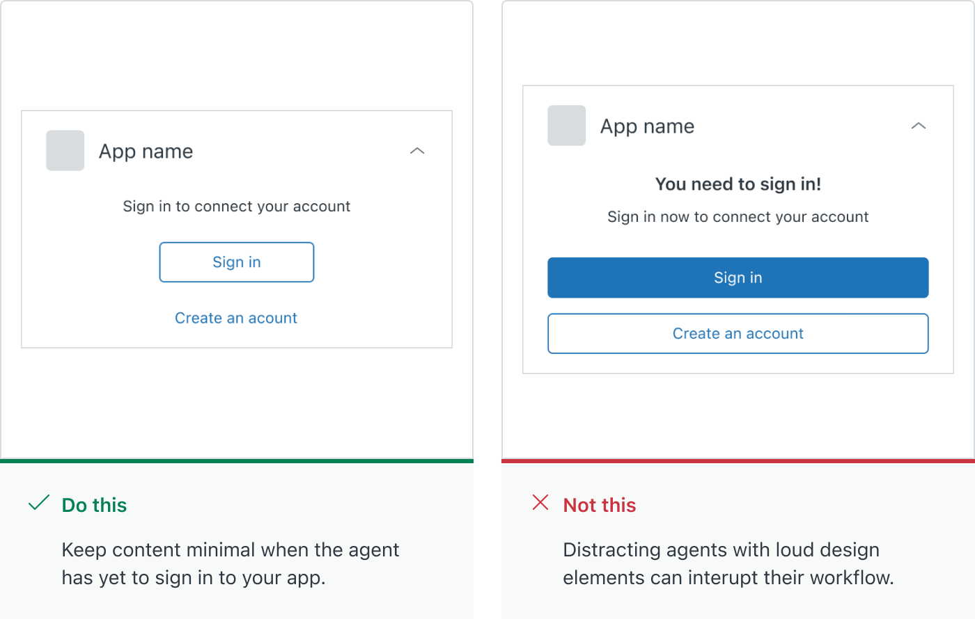
1. Keep authentication simple and immediate
Apps that integrate with other services will likely need some form of authentication to get set up. Ideally, this should be accomplished when your app is initially set up, however if your app requires individual agents to sign in, consider the following:
Keep settings that affects all users in the Settings page, rather than in the app itself.
Keep unauthenticated experiences simple to avoid distraction. Use minimal copy to convey your message, and secondary and tertiary button styles for any call to actions.
2. Make errors clear and recoverable where possible
Providing a great experience means helping users when they run in to trouble. Here are a couple of guidelines that can help you communicate issues effectively to help users recover swiftly:
Use simple language to explain what has caused the error, and how the user can resolve it.
Use a GardenAlert Notificationand display it in context of where the issue is located.
Provide a ‘Retry’ action when your app doesn’t behave as expected, for instance if it doesn’t load correctly, or it runs in to an error when performing an action.
For form elements, display the error inline. Garden’sform fieldshave this style built in and available.
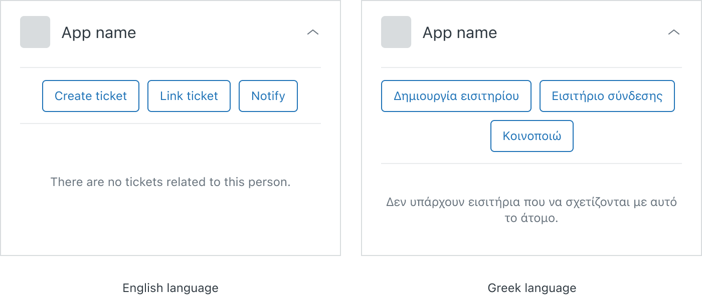
3. Consider how your app responds when localized to other languages
Zendesk places great emphasis on creating products that are easy to use by people across the world, and we encourage app developers to do the same.
Test how other languages will affect the size and spacing of components in your apps. For instance, buttons may grow in width and wrap in certain cases.
If content needs to wrap to cater for other languages, consider the height of your app and adjust accordingly.
Further reading
Learn how Zendesk Garden can be used tocreate a consistent experienceand design and build apps faster.